The Story Behind the Point Hope Logo

As with everything at Point Hope, our logo was carefully and intentionally designed to pay homage to both the land here as well as the history. It was inspired by a quote from Peter Lawson-Johnston II, a member of the Guggenheim family, about his strong connection to his family’s land:
“I heard the woods wake up.”
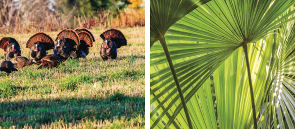
The Point Hope team worked with local Charleston graphic designer and branding aficionado Gil Shuler to create the community’s logo, which embodies both a Lowcountry palmetto frond and a fanned turkey tail. The points of the fan meet in a manner that also suggests a rising sun, for which the leaves or feathers become sunrays. All quintessentially Lowcountry.
“Visiting the property with Peter, and experiencing the natural beauty of the area really inspired the mark,” reflected Gil of the creative process. “The sunrise over the river, the wild turkeys and of course the native palms that are prevalent throughout, brought it all home to the direction/solution that we ended up with. Simple in concept and symmetrical in execution provides a memorable brand for this amazing property.”

Our primary colors are blue and green to emphasize the importance of water and nature, an enjoyment of the outdoors, and a long history of stewardship of the land. The Lowcountry is known for its extensive waterways, rivers and creeks, and blue was also one of the racing colors of Harry Frank Guggenheim’s Cainhoy Stables. The Point Hope green is the rich, mossy tone of the Lowcountry – of palmettos and resurrection ferns, of pine needles and spartina grass at its peak. Together, it all speaks to our love and respect of the land, and vision for Point Hope.